UX and UI Design
Re-design National
Rail app
Project Details
My role: Lead UI & UX Designer
Client: Personal Project (National Rail)
Year: 2017/2018
Tools used: Sketch, Photoshop, Invision, Principle
Info
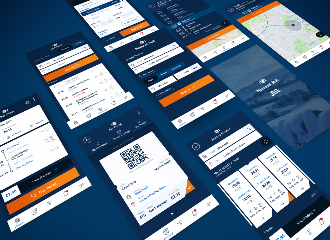
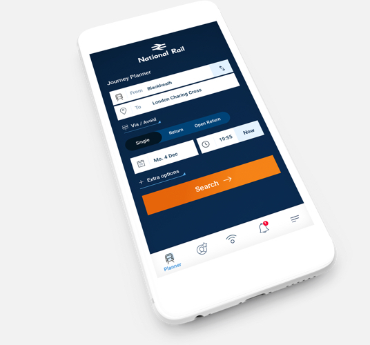
As most users are very familiar with the current app I didn’t think it was right to completly change the way it currently works. It will scare uses off, confuse them and they might not want to contine using the app. It needs to feel familiar enough - but better
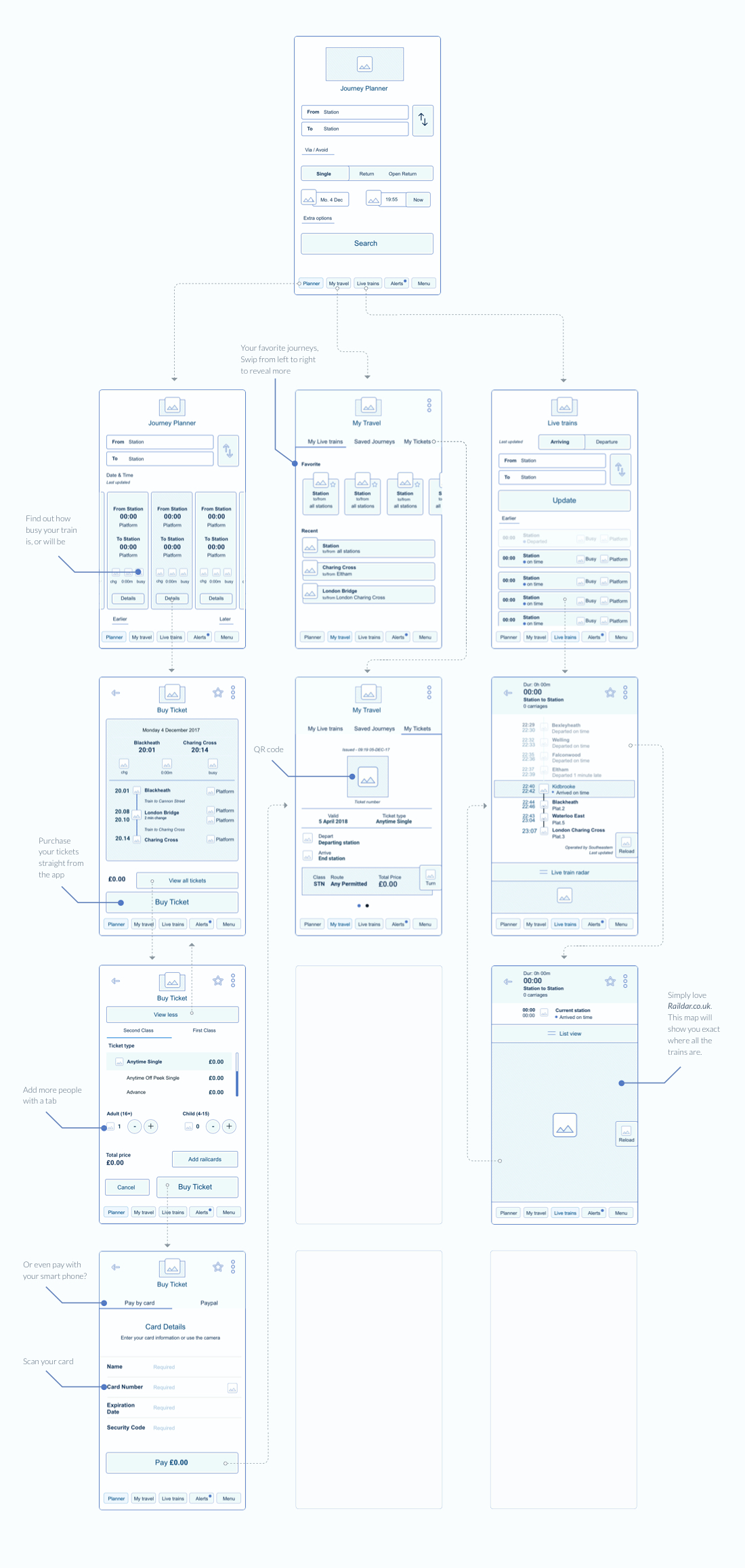
Rethink
I started out with some sketches and turned them into wireframes. Slowly found out that I could of kept going for days to improve every single tiny thing. However I did set myself a mini project so I only allowed myself to do the essentials for the time being.
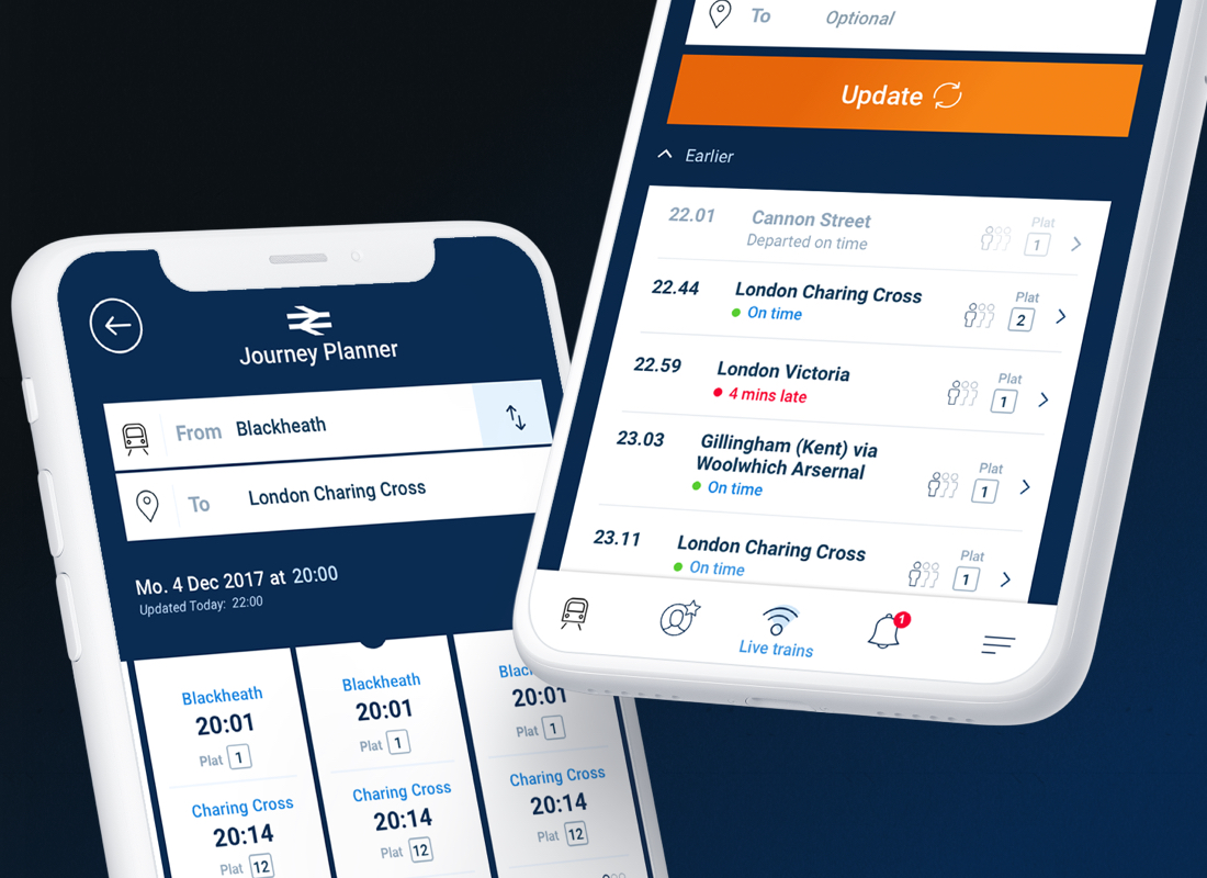
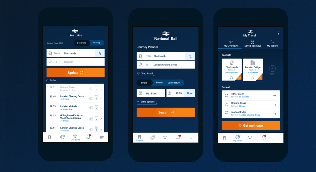
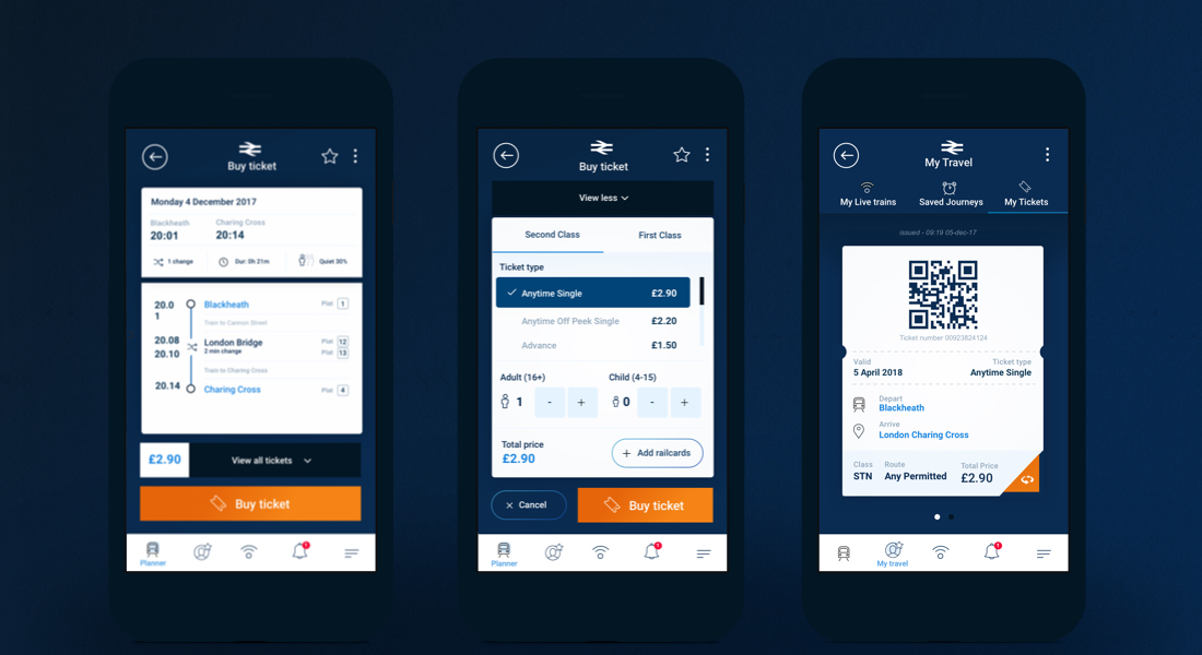
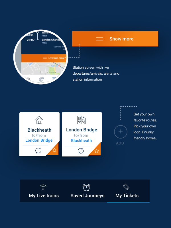
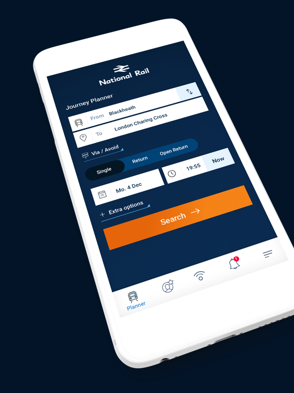
Visual designs
Modern, Clean and Functional.
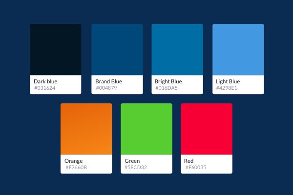
By introducing a variation of blues the app feels more lively and as one. Keeping accessibility in the back my head I have used white blocks for the key elements.
I have used a complementary orange instead of the dated yellow, to add a more classy feeling.